Handlettering
Why Handlettering?
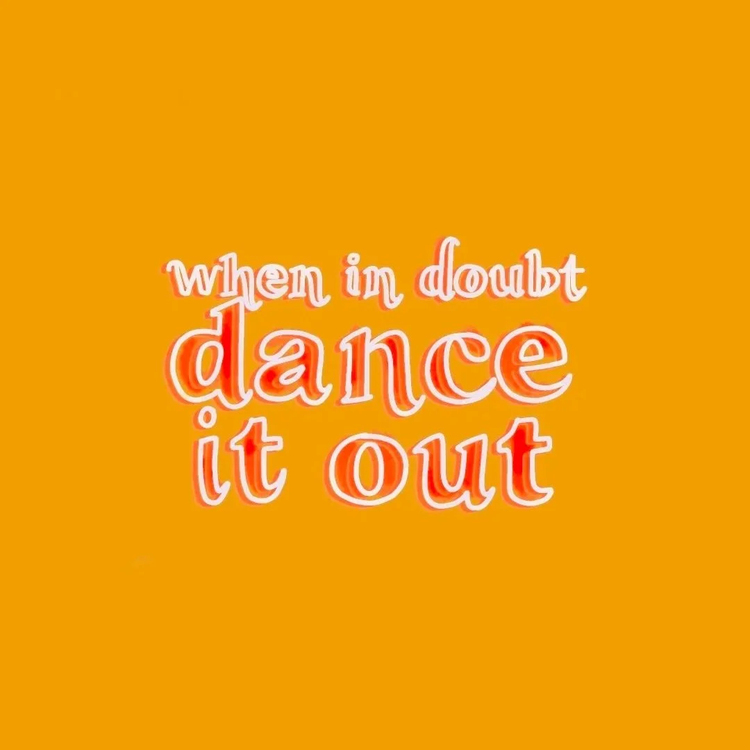
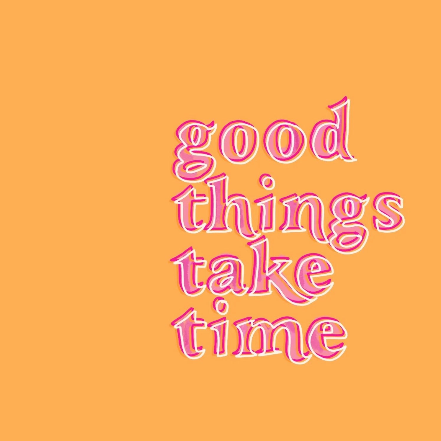
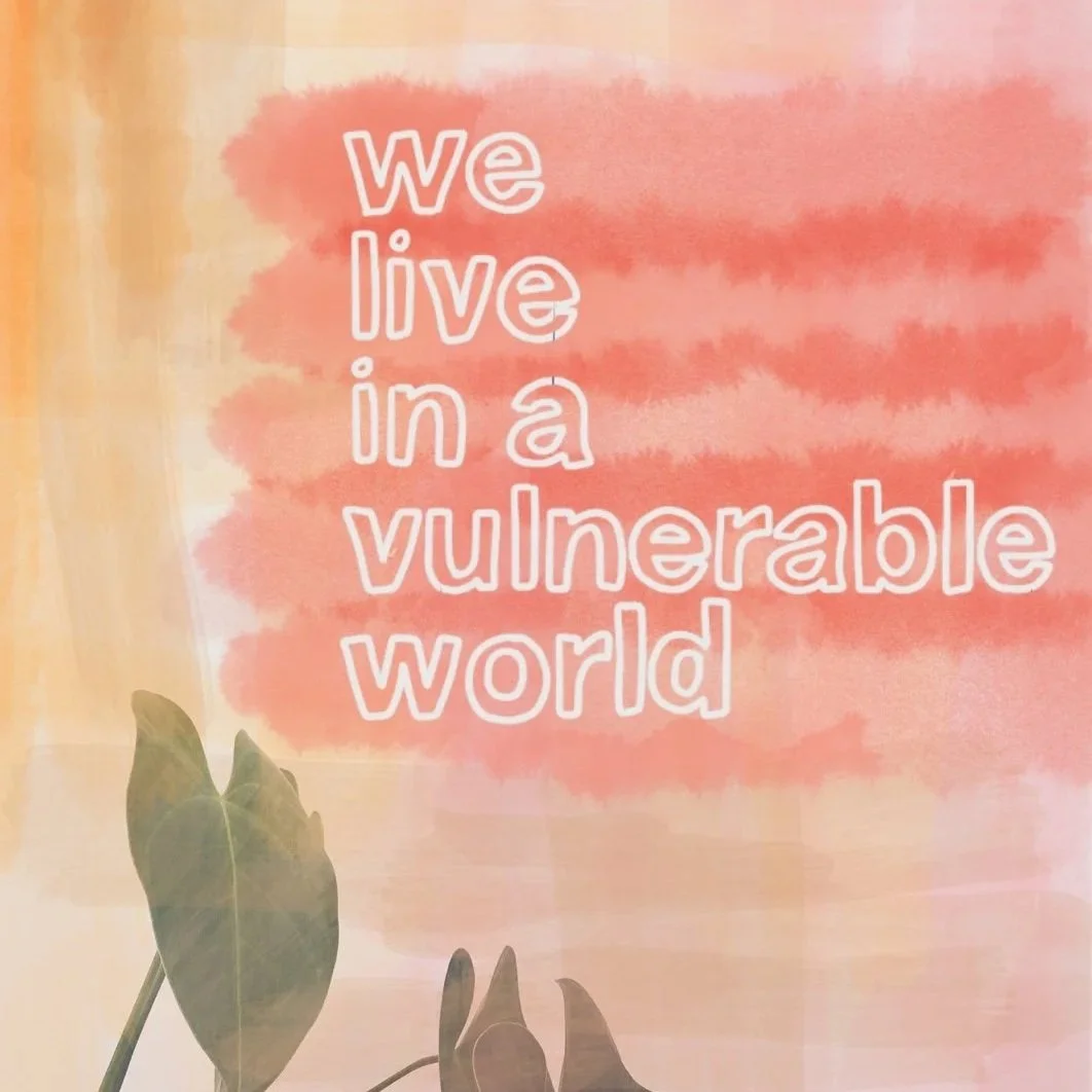
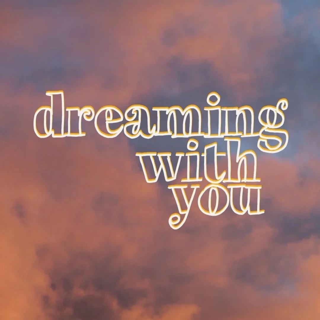
In a world of templates, trends, and endlessly reused fonts, handlettering is a way to stand out with intention. It adds personality, warmth, and a distinctly human quality that naturally draws the eye—especially in spaces where so much content blends together.
There’s often a quiet moment of surprise when people realize a piece wasn’t set in a font at all, but drawn by hand. That subtle recognition is part of what makes handlettering special—it doesn’t call attention to itself, it simply feels more alive.
How I Use It
Handlettering takes more time than choosing a typeface, and I’m honest about that. But I’ve found the payoff is worth it when the goal is to create something memorable and expressive. I use handlettering selectively, where it adds the most impact:
Social media graphics that need to stop the scroll
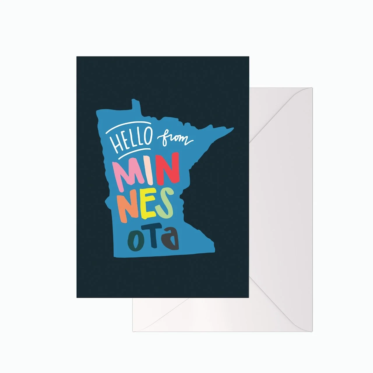
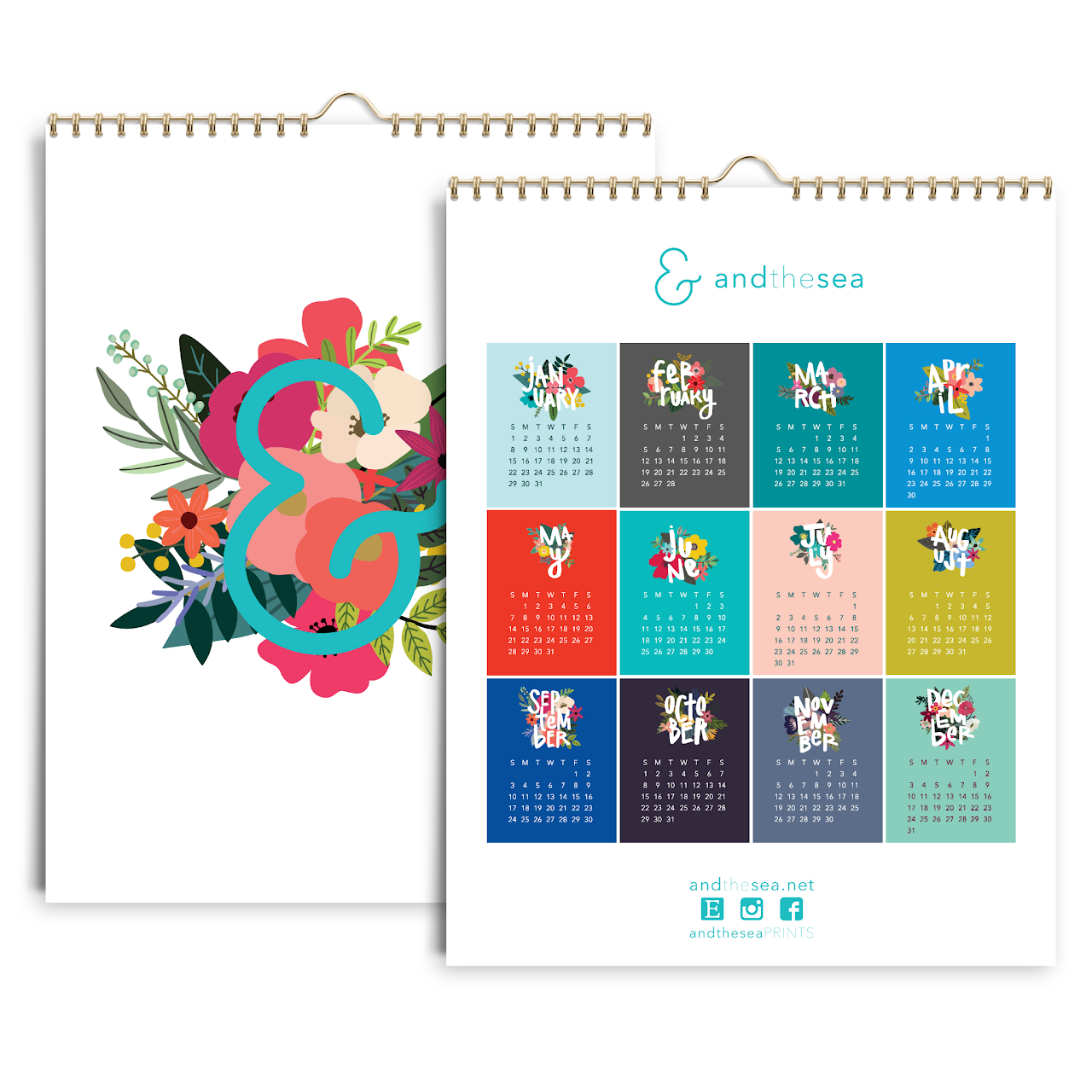
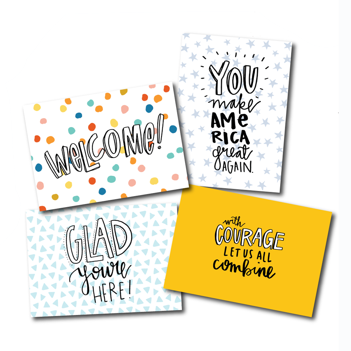
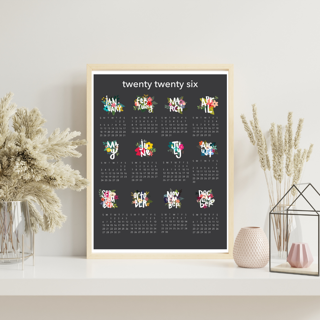
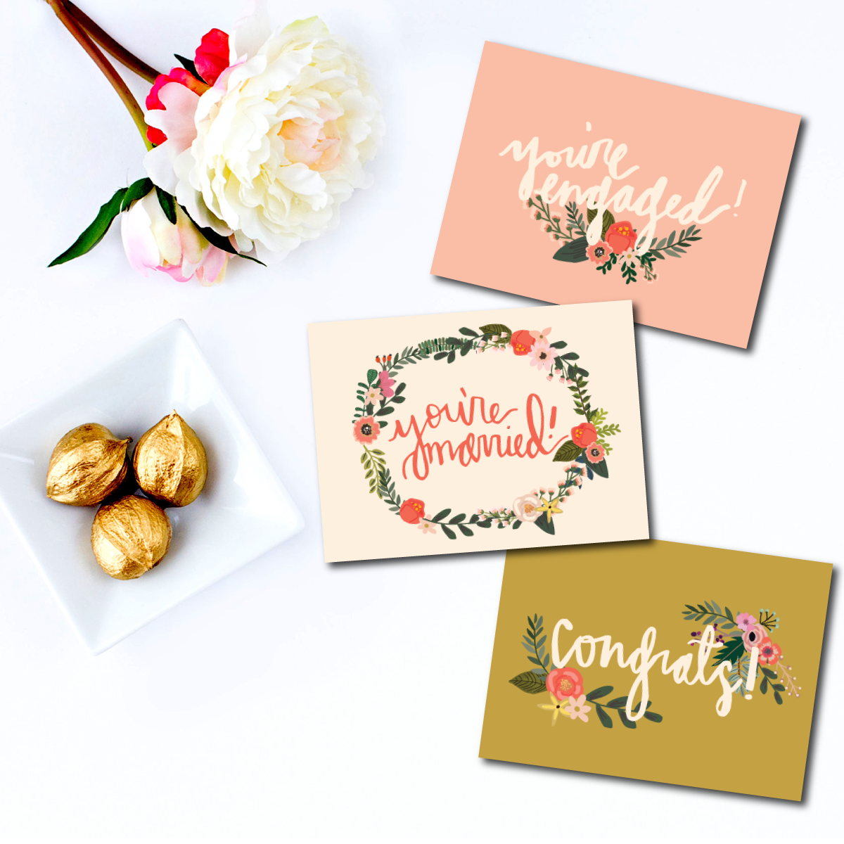
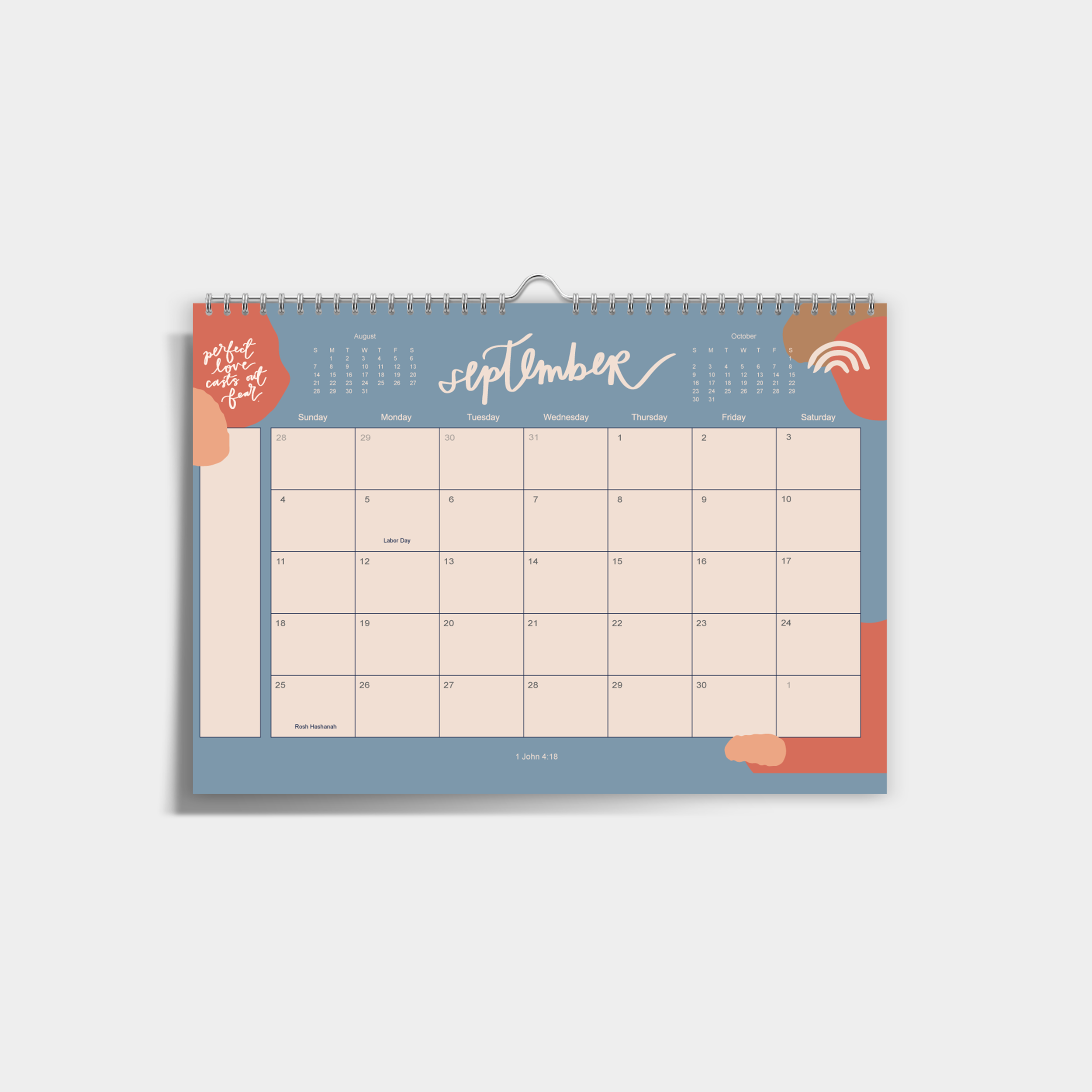
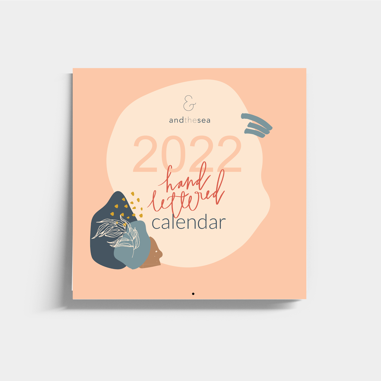
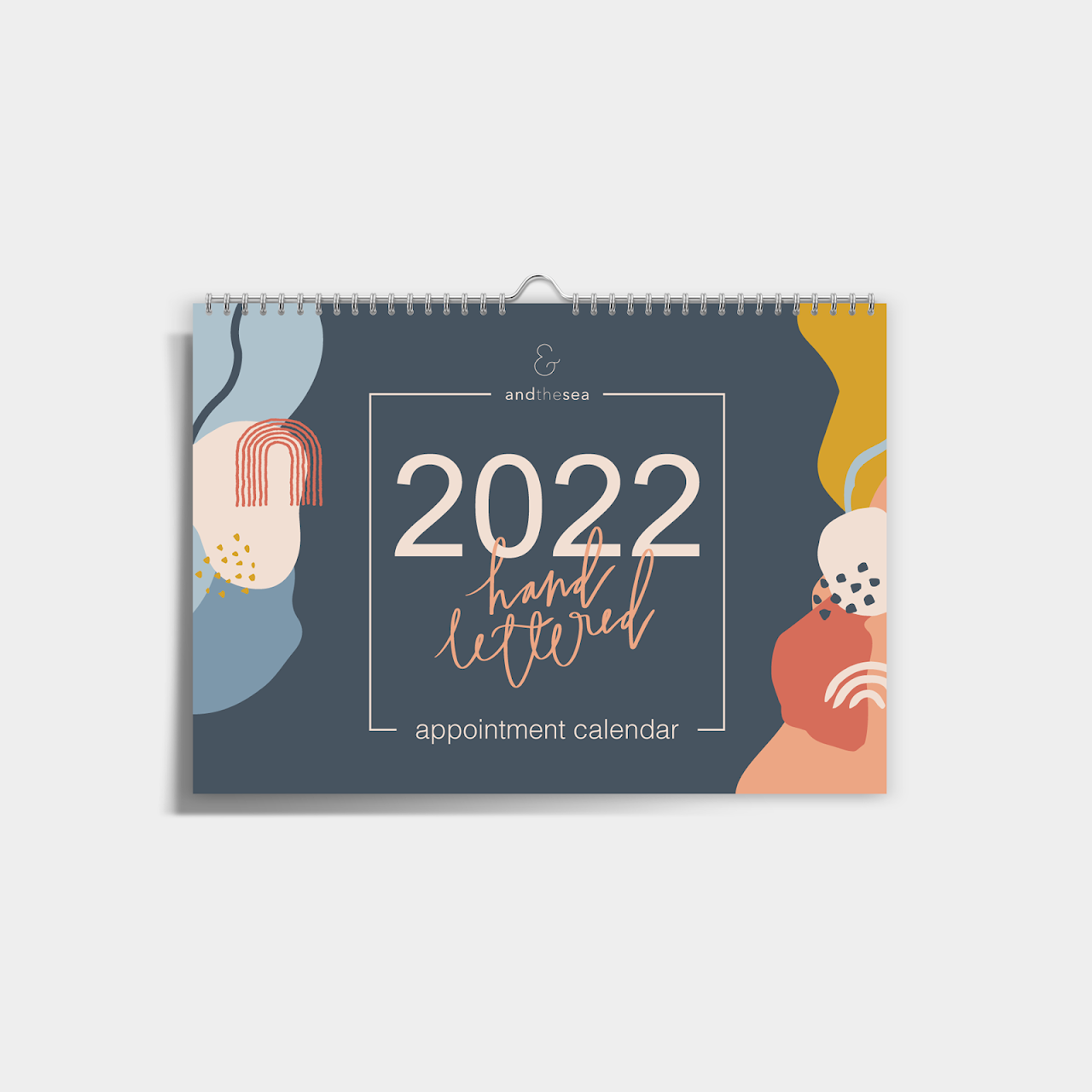
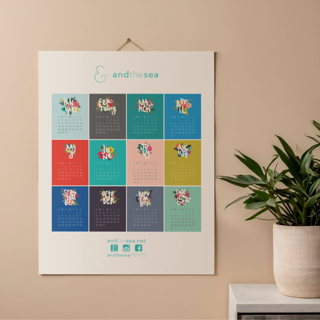
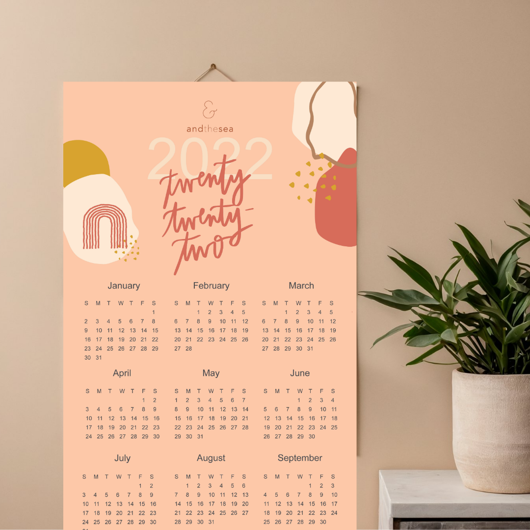
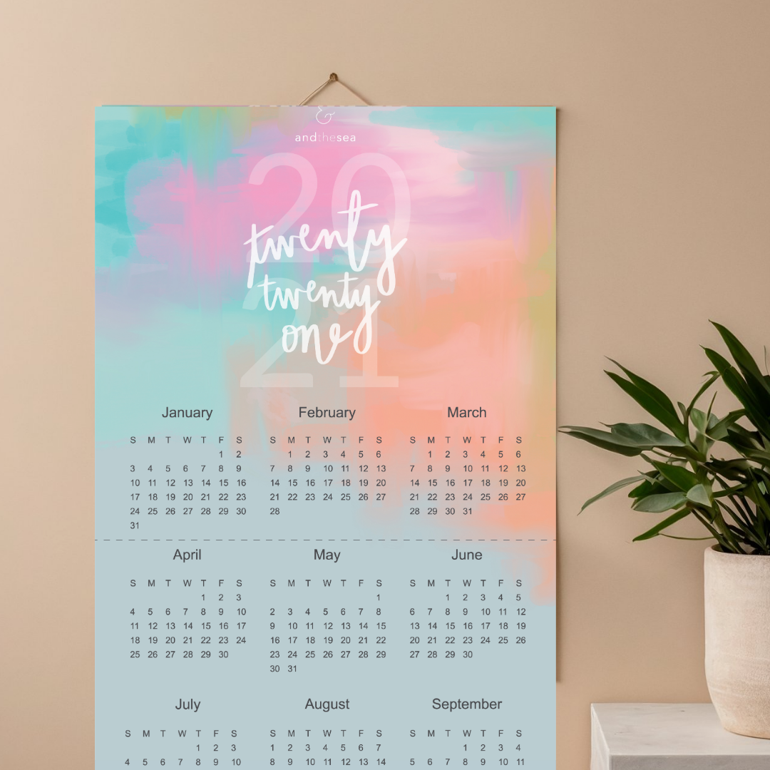
Calendars and stationery, including cards and printed pieces
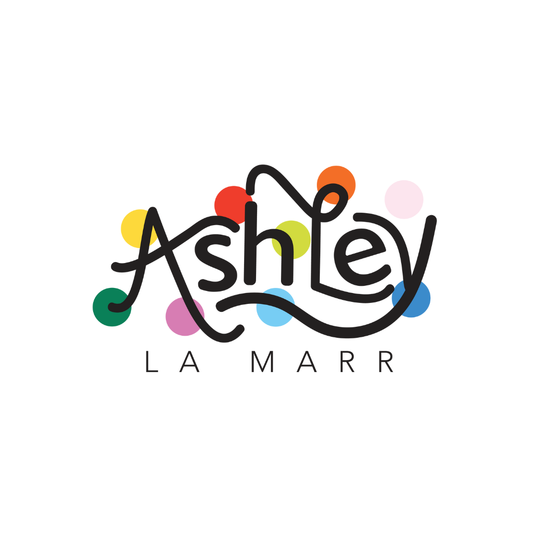
Logos that require a custom, character-driven feel
Every letter is drawn with context in mind—brand voice, audience, and purpose—so the final result feels crafted, not decorative.
The Payoff
Handlettering isn’t about perfection; it’s about presence. It brings a sense of care and originality that’s hard to replicate digitally, and it helps brands communicate in a way that feels both distinct and human.
When the moment calls for something with personality and staying power, I’m happy to take the slower, more intentional route.